Day-17 Creating Dashboard and Visualization in Kibana

Yesterday, we whipped up some alerts for Windows servers and rules for both Windows and Ubuntu servers in Kibana. Today, let’s keep the momentum going by building a dashboard for Windows servers and visualizations for both Windows and Ubuntu servers.
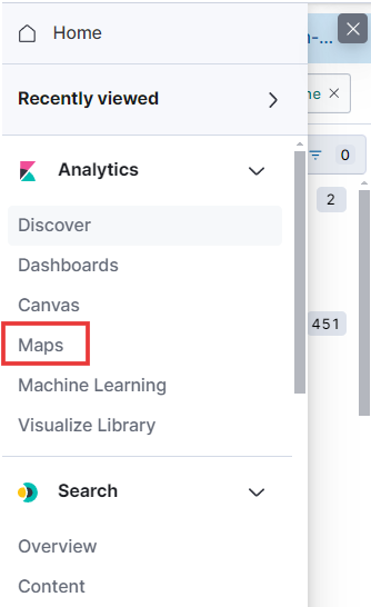
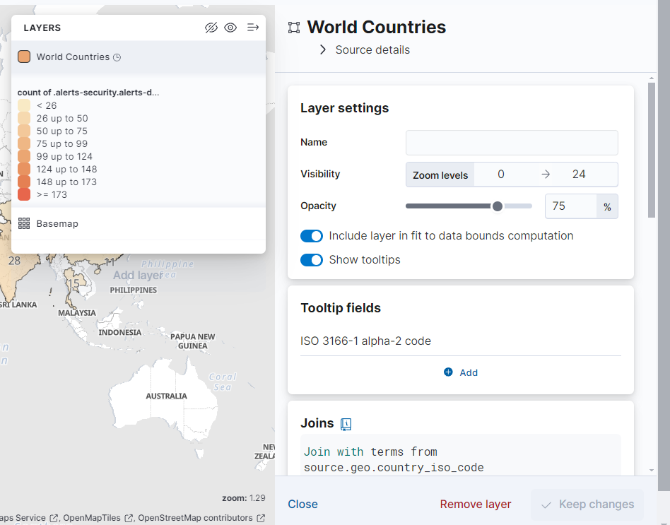
- To create the dashboard, we’ll follow the same steps we used for the Ubuntu server. Let’s start by selecting ‘Map’ from the hamburger menu under ‘Analytics.’
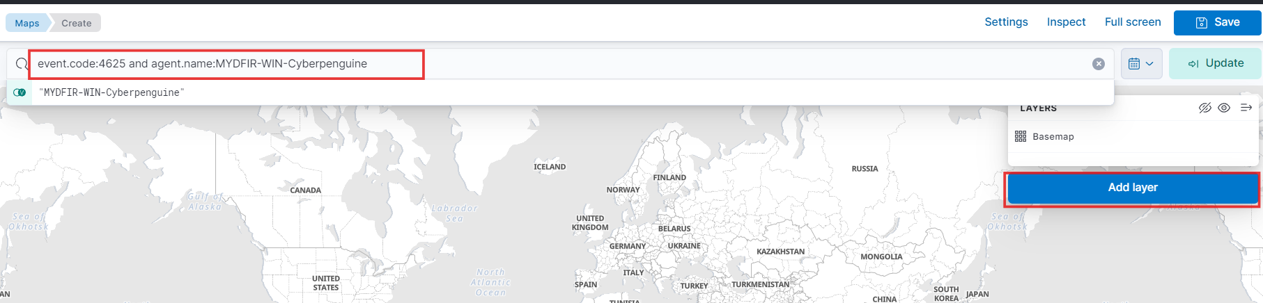
- Paste the query we created for RDP failed authentication and Add layer for windows server.
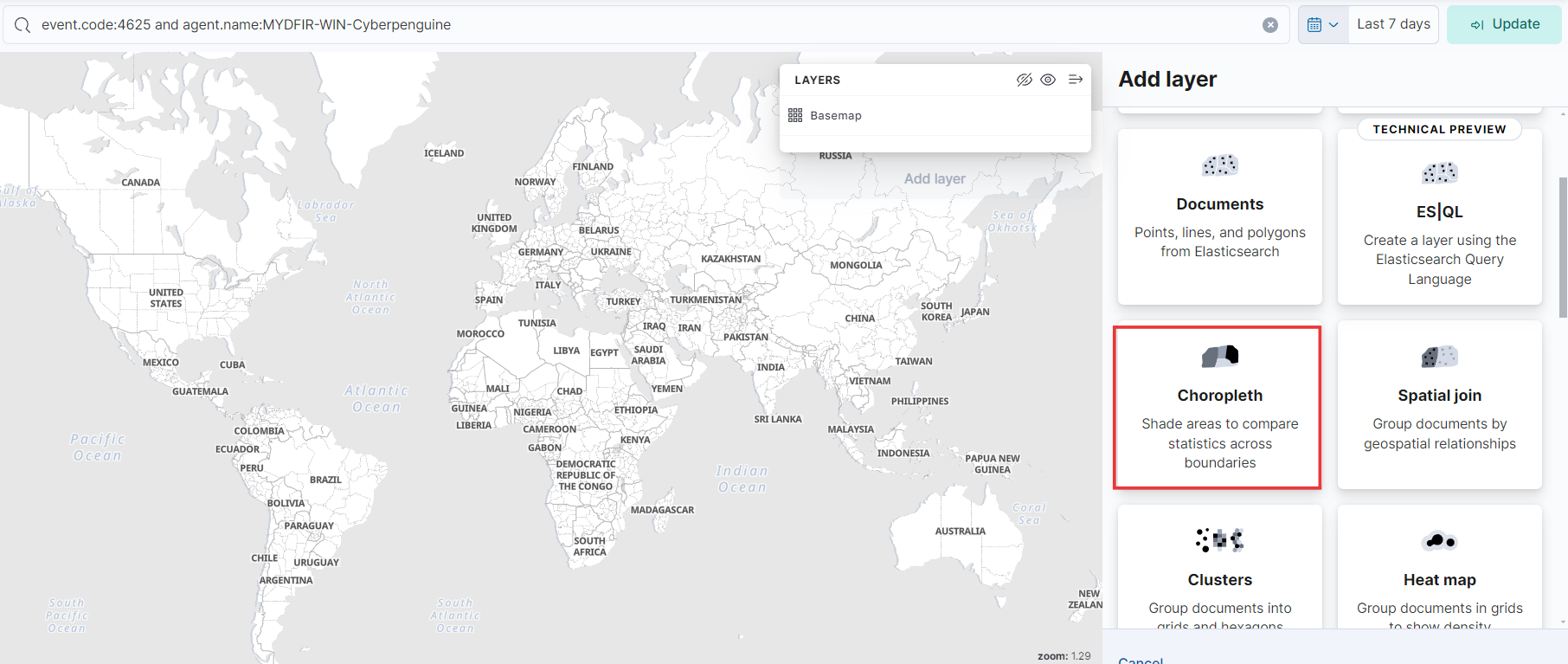
- To visualize the data by region, we’ll use a choropleth map. This type of map shades geographical areas based on data values, making it perfect for our analysis.
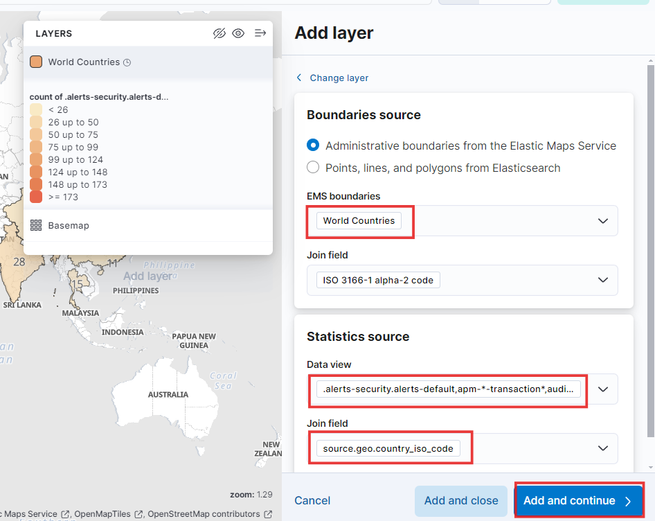
- Next, fill in the rest of the fields just like we did for the Ubuntu server. Then, click “Add and Continue.” Let’s keep the momentum going!
- Keep everything the same, close the sidebar, and save this dashboard as ‘MYDFIR Authentication Activity’ .
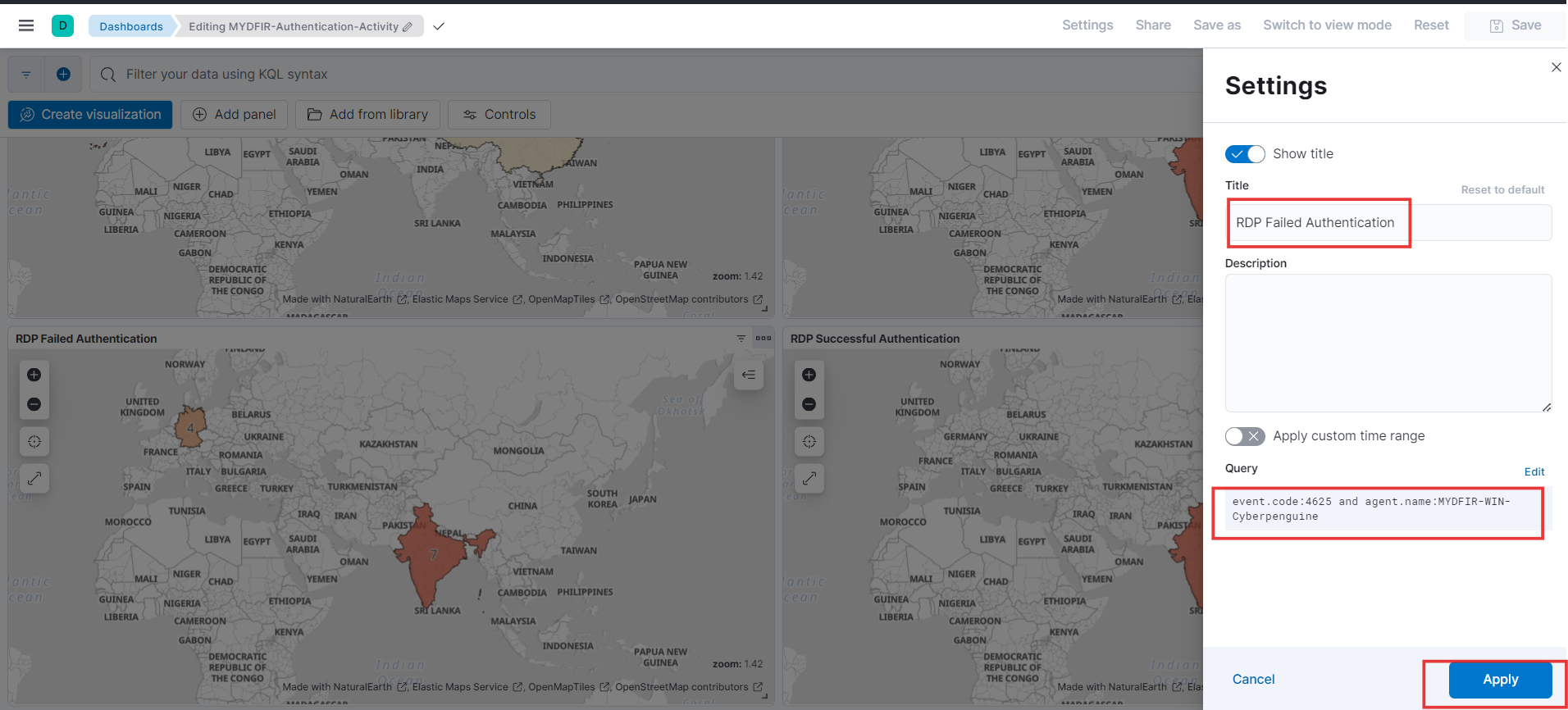
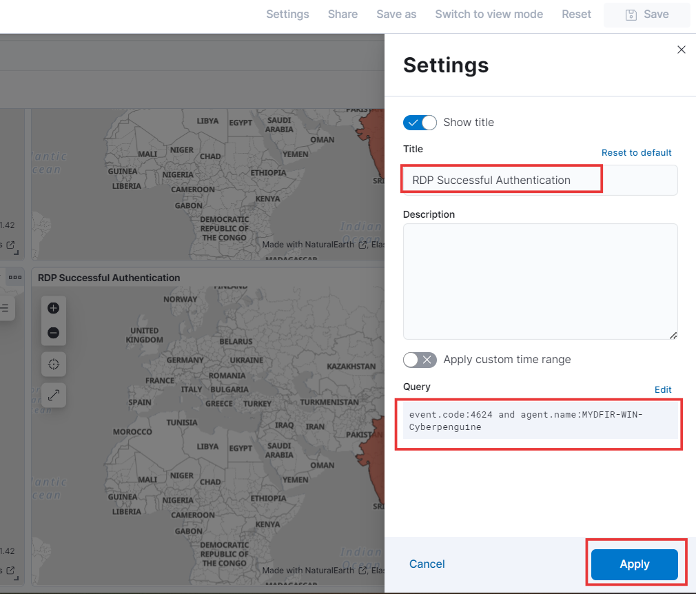
- Next up, let’s build a dashboard for those successful RDP authentication attempts. Just duplicate the existing RDP map, give it a new name, and tweak the KQL query to focus on successful logins. Remember to hit that save button before moving on! Saving our work as we go will make creating dashboards and alerts a breeze.
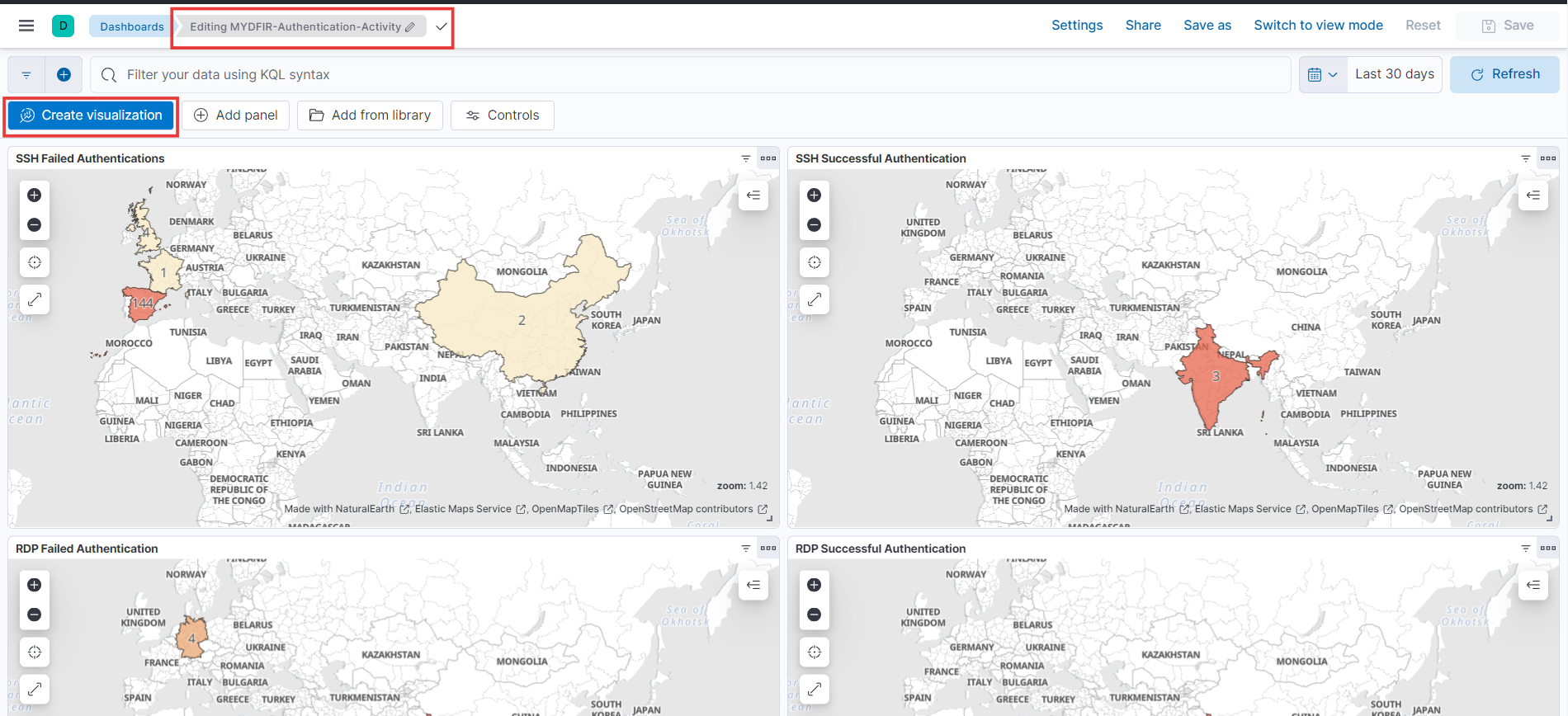
- Now that we’ve nailed those RDP authentication dashboards, let’s turn our attention to creating visualizations for both SSH and RDP. Just click the ‘Create visualization’ button on your dashboard to get started. Let’s bring these dashboards to life!
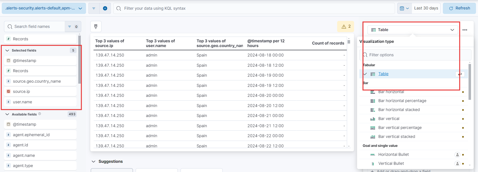
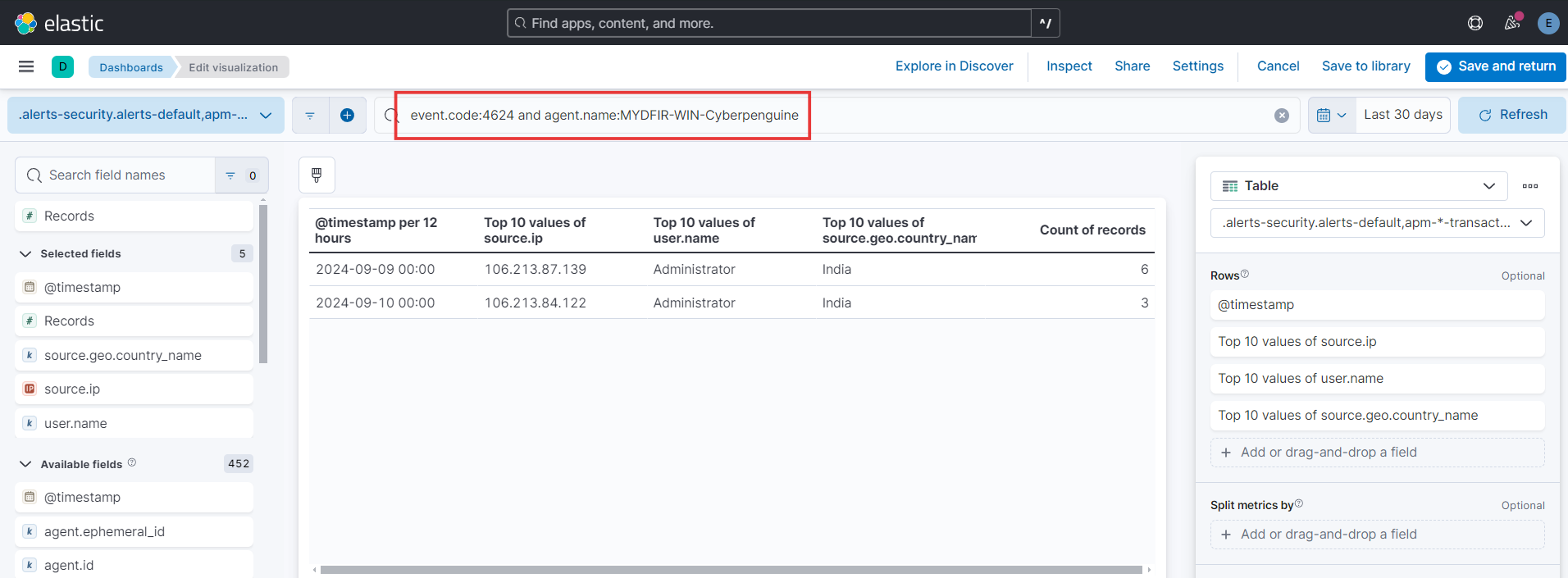
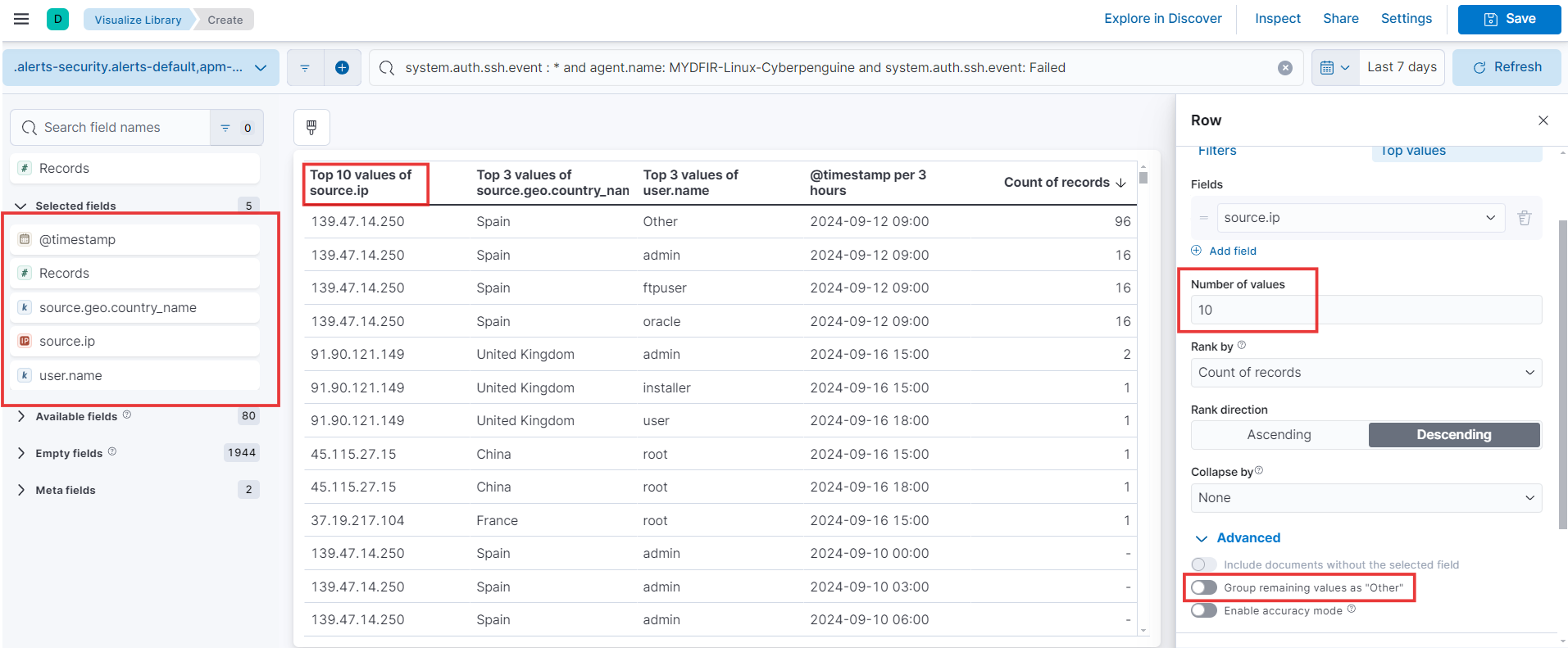
- Alright, time to pick the juicy details we want to see! Let’s choose the fields that’ll make this data sing. We’re talking source IP, username, timestamp, and even the source country (because location matters!). Now, to make it super clear for everyone, let’s set the visualization type to “Table.” Buckle up - it’s about to get insightful!
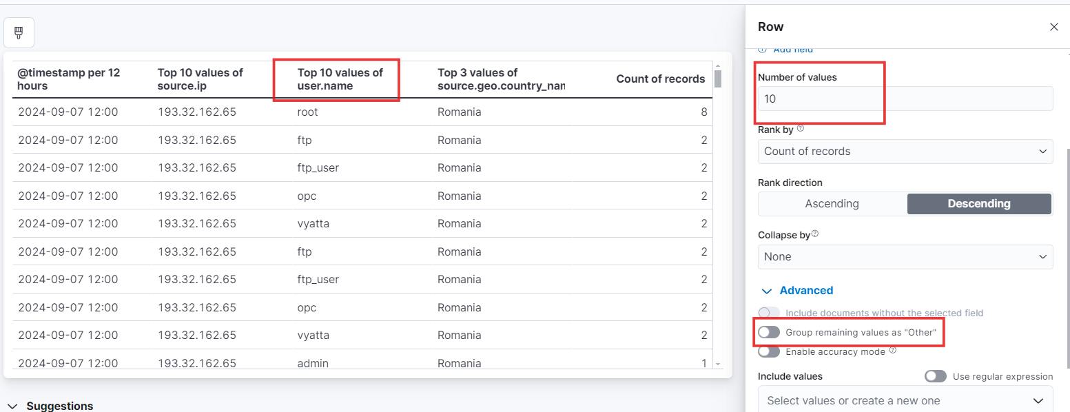
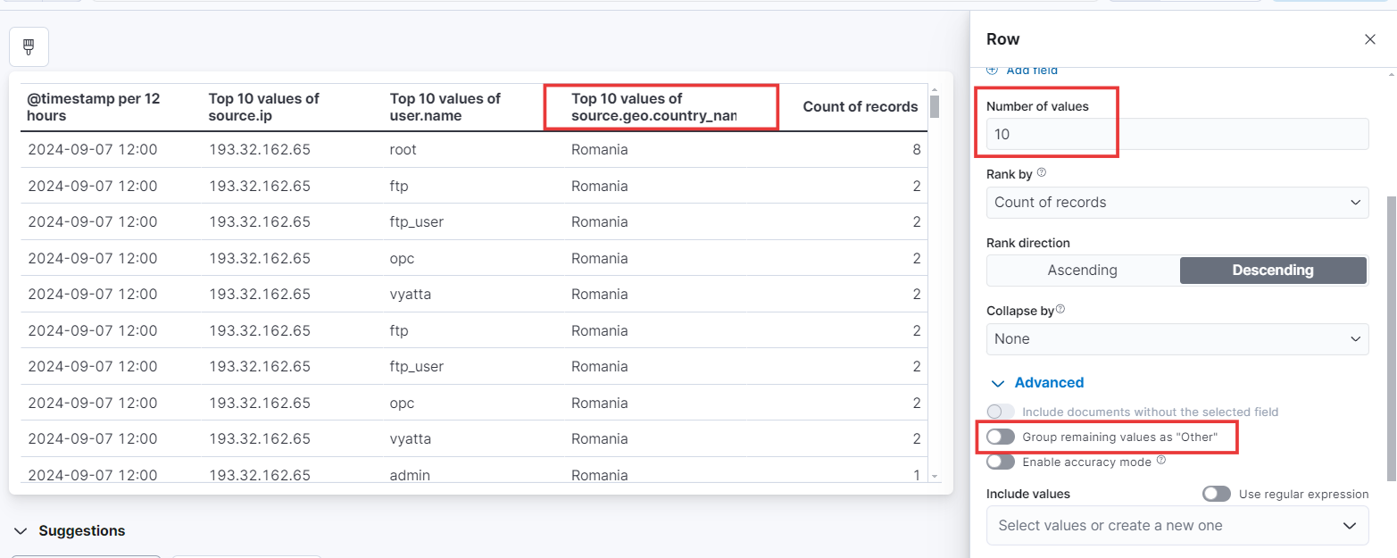
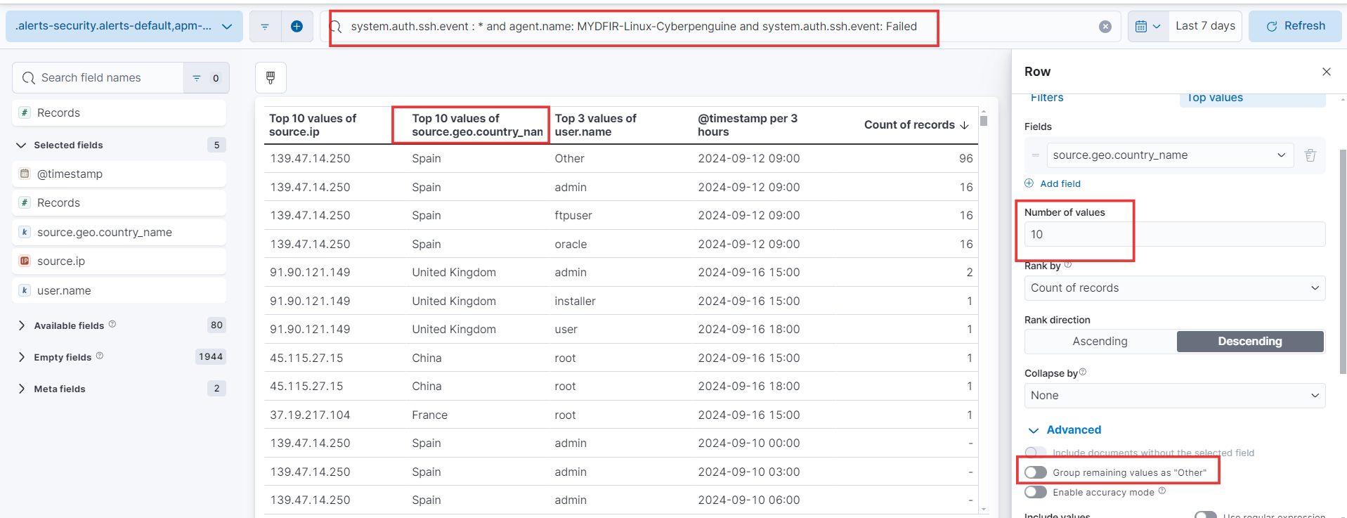
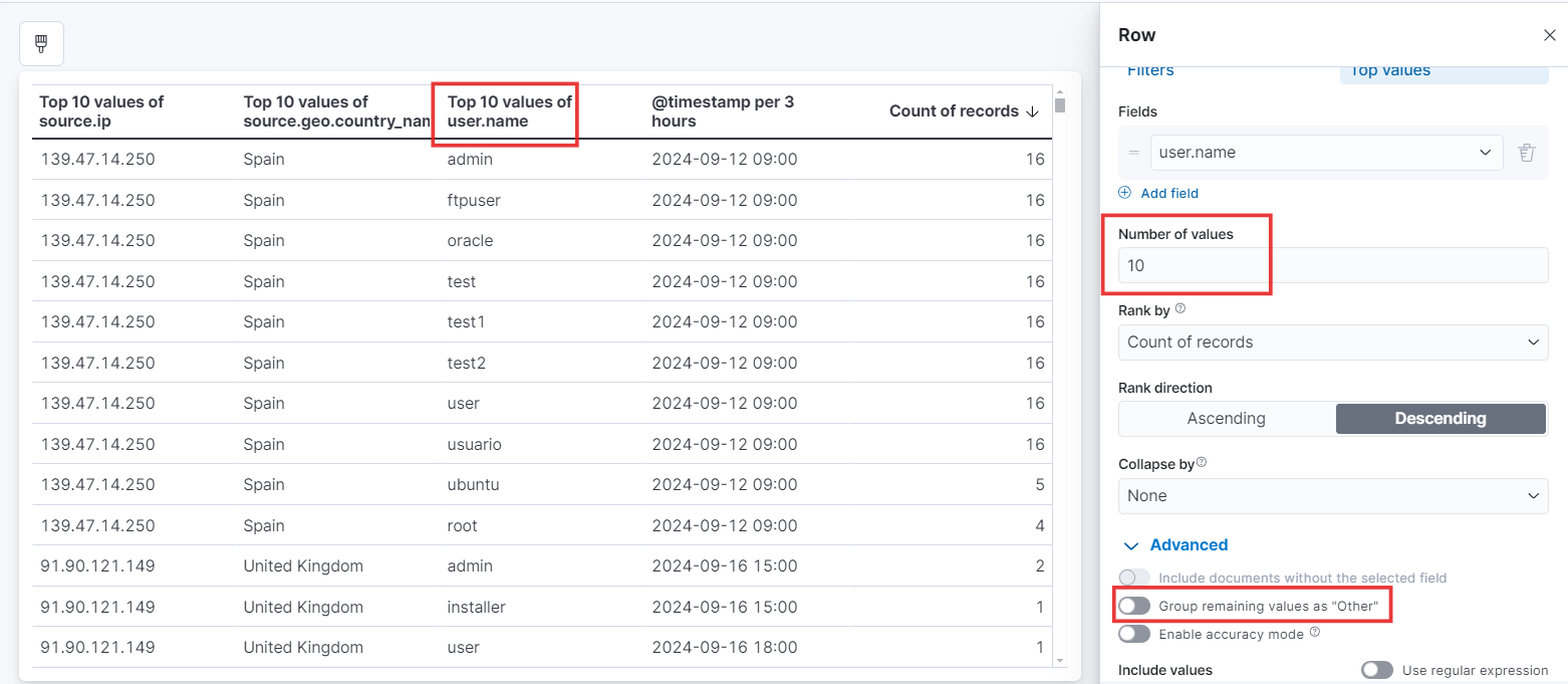
- Let’s tweak the number of values by picking the right field from the options on the right. And hey, don’t forget to uncheck ‘Group remaining values as Other’ in the Advanced settings. That’ll give us a more detailed view.
- We’ll follow the same process for each field we’ve chosen to include in our visualizations
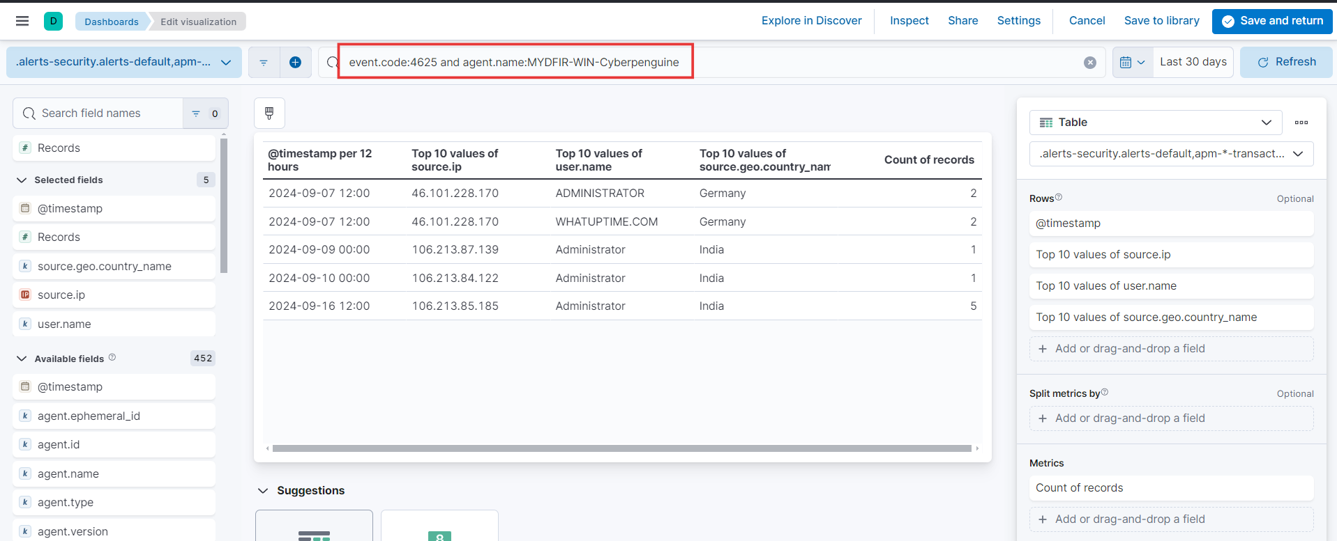
- Since we’re building this visualization for RDP, let’s paste the KQL query for Windows servers. You can do this right at the start, before choosing your fields and visualization type.
- Let’s supercharge our visualization game! To track successful RDP attempts, we’re going to duplicate an existing visualization, tweak the KQL query, and give it a fresh new name. It’s like a visual makeover for our data!
- Now that we’ve got our RDP visualization dialed in, let’s turn our attention to SSH authentication. We’ll follow the same steps we used for RDP and just swap out the query to focus on SSH failed attempts. Let’s get visualizing!
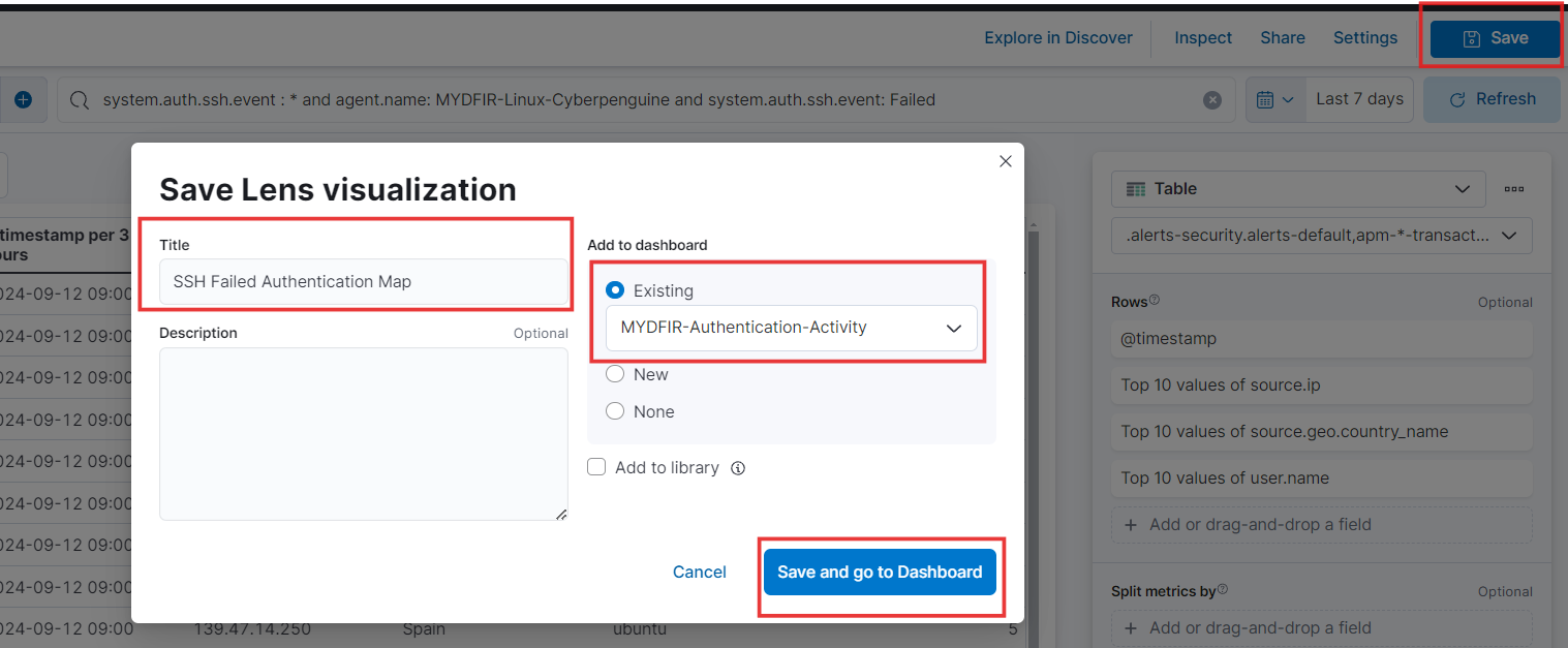
- Save it on existing Dashboard.
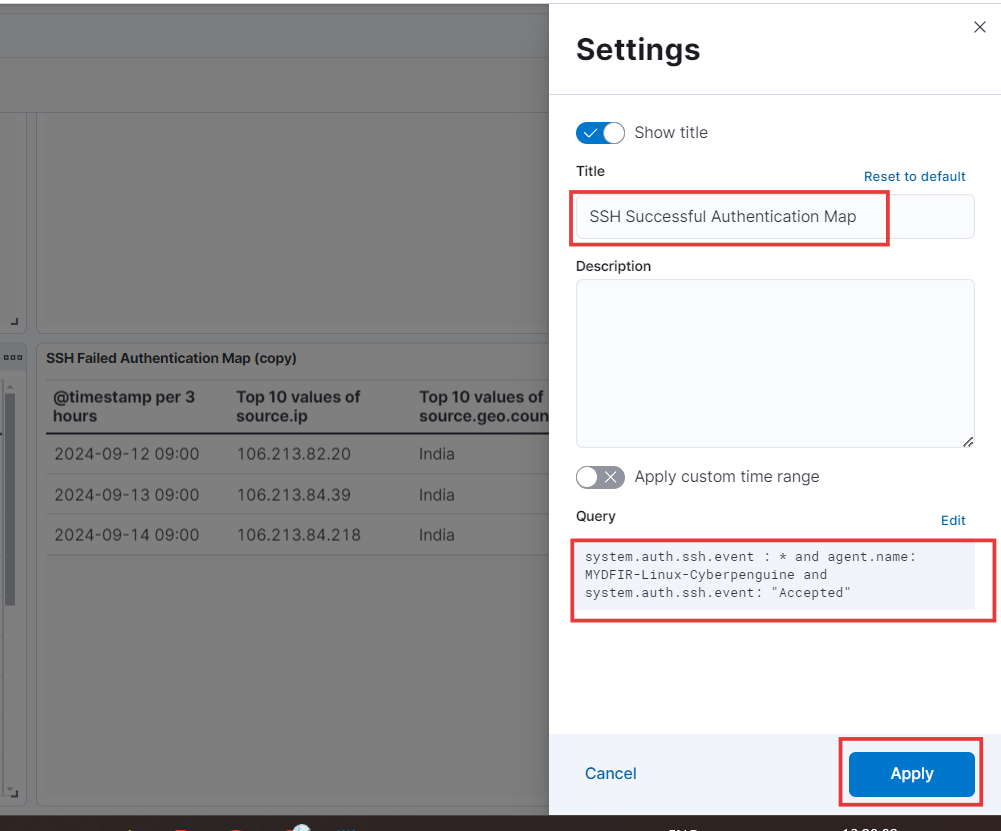
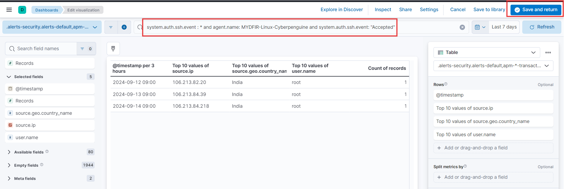
- Let’s follow the same playbook to create the SSH Successful Authentication visualization. We’ll just duplicate the SSH failed authentication one and tweak the KQL. Then, hit save and head back to the dashboard.
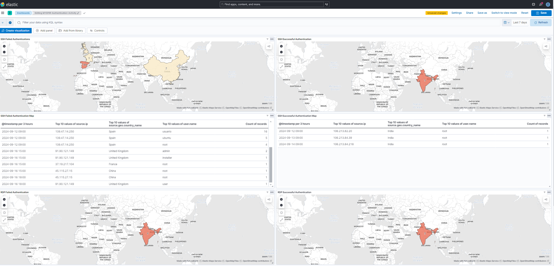
- 🥁Drumroll, please! Behold my masterpiece – my shiny new dashboard, complete with maps and visualizations. Don’t forget to hit that ‘Save’ button so you can keep admiring it later!
This blog might have seemed a bit repetitive, but practice makes perfect! Going over these tasks again and again will help you remember the steps like the back of your hand. Now, feel free to let your creativity run wild and customize the maps and visualizations to your heart’s content!
This post is licensed under CC BY 4.0 by the author.